Blog » Visualisation
As you might remember I have spent quite some time exploring how to apply data visualisations to codebases. My interest waned a bit with the rise of microservices, because the codebases got much smaller and the programming languages more varied (which was bad from a tooling perspective). However, when our podcast hosts Rebecca and Ashok asked me whether I was interested in joining a podcast on this topic, together with Korny, who has done some great work in this field recently, I obviously couldn't resist. Here's the result.
Comments and related posts
At the moment I'm playing with D3.js trying to recreate some of the polymetric diagrams pioneered in CodeCrawler. (You can see my progress on that over here.) In the process it occurred to me that it should be relatively trivial, using the same tools, to recreate the Toxicity charts we did years ago. Having an HTML5 version would be quite welcome, too, because the original implementation uses Excel features that only work on Windows.
Well, turns out it wasn't too difficult and the result is available in this Github repository. I like the fact that with HTML we can have much richer tooltips compared to the Excel version. What's even better, though, is that because it is an HTML solution I can inline the fully interactive chart in this post:
Read the rest of this post
Last August I completed my tenth year with ThoughtWorks, and we have a tradition to let people take a three-month long sabbatical leave after ten years. Mine got postponed a bit but now I'm off, until August.
During my leave I'll take it easy, spend more time with the family, but I'm also going to make some progress on the Softvis project that Jonathan McCracken and I started a long time ago. You can see the first steps here: softvis.github.io. More in three months. Hopefully.
If you are interested in writing up a visualisation and contributing it to the project, please get in touch! Maybe, if we get enough visualisations written up, we'll publish them in a book.
Comments and related posts
As a consultant I often find myself in a position where I have to get to know a large existing code base quickly; I need to understand how the code is structured, how well it is written, whether there are any major issues, and if so, whether they are localised or whether they are spread throughout the code base. To get a feeling for the general quality of the code I have found Toxicity charts useful. To understand the structure, Dependency Structure Matrices come in handy. Conceptually somewhere between those two lie metrics tree maps, which I want to write about today.
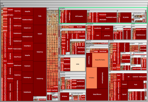
A metrics tree map visualises the structure of the code by rendering the hierarchical package (namespace) structure as nested rectangles, with parent packages encompassing child packages. The actual display is taken up by the leaves in this structure, the classes. Have a look at the following tree map which shows the JRuby code base, without worrying too much about the "metrics" part yet.

At the top right I have highlighted the org.jruby.compiler package. The tree map shows that this package contains a few classes, such as ASTCompiler and ASTInspector, as well as three subpackages, namely impl, ir, and util, with util for example containing a class called HandleFactory, visible on the far right. (Visible in the full-size version.) In the following I explain how the tree maps visualise metrics, and I will explain how to create such maps from Java source code. As usual, adapting this other programming languages is relatively easy.
Read the rest of this post
This is just a quick post to raise awareness for a technique that has been around for a while. In software architecture a Dependency Structure Matrix (DSM) can be used to understand dependencies between groupings of classes, that is packages in Java and namespaces in C#. There are obviously other uses, and this Wikipedia article has more background information.
Returning to classes and packages, the following matrix shows a view of some of the core classes of the Spring framework:

In this typical package DSM the packages are listed on both axes. If a package has dependencies on another package, the number of dependencies is listed at the intersection. The package that has the dependency is on the top, the package that it depends on is on the left. In the example above the matrix shows that there are seven dependencies from the beans.propertyeditors package to the core.io package.
Read the rest of this post
The practice of continuous integration is gaining widespread adoption and almost every project I was involved in over the past few years used a continuous integration server to maintain an up-to-date view on the status of the build. Developers can look at the status page of the server or use tools such as CCTray and CCMenu to find out whether a recent check-in has broken the build. Some teams also use build lights, like these for example, or other information radiators to make the status of the build visible.
The reason why developers need an up-to-date build status is a common, and good, practice: new check-ins are only allowed when the build is known to be good. If it is broken chances are that someone is trying to fix it and dumping a whole new set of changes onto them would undoubtedly make that task harder. Similarly, when the server is building nobody knows for sure whether the build will succeed, and checking in changes would make fixing the build harder, should it fail.
To recap: the build must be good for a developer to be able to check in. On one of our projects this was becoming a rare occurrence, though. In fairness, the build performed fairly comprehensive checks in a complex integration environment, involving an ESB and an SSO solution. The team had already relegated some long-running tests to a different build stage, and they had split the short build, ie. the build that determines whether check ins are allowed, into five parallel builds, bringing build time down from over 45 to under ten minutes. Still, developers often found themselves waiting in a queue, maintained with post-its on a wall, for a chance to check in their changes. Not only that but everybody felt the situation was getting worse, that the build was broken more often. This was obviously a huge waste and I was keen to make it visible to management using a visualisation.
Read the rest of this post
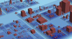
Over the past years I have shown everyone who could not run fast enough some of the tools based on Moose. And even now I cannot resist putting a screenshot of CodeCity into this post.

Most of the Moose tools now use the MSE file format as an interchange format. By the way, if you are interested in writing your own visualisations or analysis tools it is probably worthwhile looking at MSE, reading this format is so much more convenient than parsing source code.
In Java it was always relatively easy to create MSE files. Among many other things, iPlasma can read Java source code and export to MSE. That said, iPlasma has so many interesting features itself that oftentimes no export to an external tool is necessary.
For C# the story was different and for one reason or another no tool existed that could create MSE files for C#. This has changed now. As a student project at the University of Lugano such a tool was written and, thanks to Michele Lanza, then donated for general use. I've made a few improvements and put the code into this Bitbucket repository.
Comments and related posts
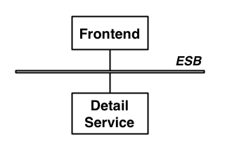
At some point last year I was asked to review the architecture of the software behind a large and popular website. The resident architect explained how he had followed a modern approach, decoupling the web front-end from back-end services that provide content. To gain further flexibility he had put the front-end and the services on an ESB, mostly to cater for the possibility to make the content available to other consumers. In short, the architecture diagram looked a lot like many others: nothing to see here, move on.

The diagram above only shows one of the content services, which for the sake of this article is a service that provides contact details for a person.
Based on conversations with the project sponsors I began to suspect that at least the introduction of the ESB was a case of RDD, ie. Resume-Driven Development, development in which key choices are made with only one question in mind: how good does it look on my CV? Talking to the developers I learned that the ESB had introduced "nothing but pain." But how could something as simple as the architecture in the above diagram cause such pain to the developers? Was this really another case of architect's dream, developer's nightmare?
Read the rest of this post
Update: I have reimplemented the charts in HTML5. See Toxicity reloaded.
If you are somebody who writes code you probably know that moment when you look at some code you didn't write, or some code you wrote a long time ago, and you think "that doesn't look good." Ok, more realistically, you probably think "WTF? I wouldn't want to touch that with a barge-pole!" It is not even so much about whether the code does what it should do—that takes a bit longer to figure out—or whether the code is too slow. Even if it's perfectly bug free and performs well, there's something to the way it's written. This is part of the internal quality of a software system, something that the users and development managers can't observe directly; yet, it still affects them because code with poor internal quality is hard to maintain and extend.
Now, as a developer, how do you help managers and business people understand the internal quality of code? They generally want a bit more than "it's horrible" before they prioritise cleaning up the code over implementing new features that directly deliver business value. Or even: how do you figure out for yourself how bad some code actually is in relation to some other code? These were questions that Chris Brown, Darren Hobbs, and myself were asking ourselves a couple of years ago.
The answer came in the form of a simple bar chart, arguably not the most sophisticated visualisation but a very effective one. And our colleague Ross Pettit had the perfect name for it: The Toxicity Chart. Read on to see what it is and how it's created.
Read the rest of this post
One of my favourite tools to render graphs is GraphViz Dot and in an earlier entry I described how to use it to visualise Spring contexts. Today I want to showcase a different application.
Call graphs show how methods call each other, which can be useful for a variety of reasons. The example I use here is the graph rooted in a unit test suite, and in this case the graph gives an understanding of how localised the unit tests are, how much they are real unit tests or how close they are to mini-integration tests. In an ideal case the test method should call the method under test and nothing else. However, even with mock objects that's not always practical. And if, like myself, you fall into the classicist camp of unit testers, as described by Martin Fowler in Mocks aren't Stubs, you might actually not be too fussed about a few objects being involved in a single test. In either case, looking at the call graph shows you exactly which methods are covered by which unit tests.
There are several ways to generate calls graphs and I'm opting for dynamic analysis, which simply records the call graph while the code is being executed. A good theoretical reason is that dynamic analysis can handle polymorphism but a more practical reason is that it's actually really easy to do dynamic analysis; provided you use the right tools. The approach I describe in this article uses Eclipse AJDT to run the unit tests with a simple Java aspect that records the call graph and writes it out into a format that can be rendered more or less directly with Dot. Of course, this technique is not limited to creating graphs for unit test; it only depends on weaving an AspectJ aspect into a Java application.
Read the rest of this post
The Spring framework has become ubiquitous in the Java world, and there are a large number of tools supporting developers of Spring-based applications. In this post I describe SpringViz; or, more accurately, my variant of it.
SpringViz helps developers with what is at the heart of a Spring-based application, the container and the contexts files that describe the beans. In larger projects these context files can grow quite a bit. Newer versions of the Spring framework introduced features that help reduce the clutter and there are vast numbers of blog posts voicing different opinions on what should and what shouldn't be in a context file but, no matter what, the number of beans in the context files will grow with the size of a project, and at some point it becomes difficult to understand the overall structure. This is no different from trying to maintain an understanding of a large codebase. In fact, I consider the context files to be code rather than configuration.
I've argued before (here and here for example) that to deal with the complexity and sheer size of software systems we need a 1000ft view. This is a view that uses visualisation techniques to aggregate large amounts of data and multiple metrics into one big picture. SpringViz provides that 1000ft view for Spring context files.
Read the rest of this post
I have looked at applications of visualisations techniques to improve software quality for good while now, and at a QCon conference earlier this year Floyd Marinescu and I chatted about my current thinking. If you are interested, the full interview has been published on InfoQ now. More here.
Comments and related posts
As you might know one of my main interests at the moment is software visualisation, and the success of the talk that Gregor and I are giving at conferences at the moment shows that there's something to it; I guess.
So far, we've mostly been using ad-hoc tools, made up from small building blocks such as GraphViz Dot and custom scripts to munge file formats. This can get you quite far, but how much further can you get with real tools?
With this question in mind, I visited Michele Lanza at the Univerity of Lugano when I was in Switzerland last week. I had been playing with his CodeCrawler for a while, especially since it started working with Java codebases courtesy of java2cdif, but I was curious what Michele and his PhD students are working on now.
The individual projects are a clear evolution of the ideas behind CodeCrawler, making use of interaction and filtering to cope with large amounts of data, and some of them add time as another dimension, which is interesting because I had also found identifying trends one of the most powerful uses of visualisation on several projects.
If you are interested in this field, have a look at Michele's site, all the tools and related papers are linked from there.
Comments and related posts
